Introducing the New FreeConference.com Meeting Room
Over the past few months, we’ve been taking into consideration how our clients use our video conferencing technology, especially on the new Meeting Room where most of the magic happens! Through research, planning and diligently reaching out to clients, we’ve been assessing what we can do in the back-end to improve the customer in-call experience in the front-end.
Based on current trends, how clients are using the current technology, and how we see video conferencing shaping over the coming year, here’s what we’ve done to make FreeConference.com stand out and be a key player in the industry:
New Toolbar Location
A Dynamic Toolbar
Better Access to Settings
Updated Information Bar
By updating these functions, we’ve been able to improve the meeting room user experience and make it work more smoothly. Welcome to the updated FreeConference.com Meeting Room that is decluttered and easier to host and moderate meetings. Here’s what we’ve got in store for you:
1. The New Toolbar Location
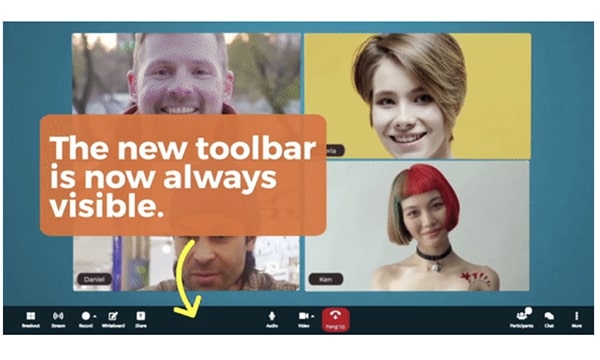
While researching to see how participants were navigating the Meeting Room, it became clear that the floating menu with key commands (mute, video, share, etc) wasn’t easily accessible because it was only seen when the mouse was moved on-screen or the display was tapped. Not being able to view the toolbar at all times was less of a help and more of a hindrance!
Now, the toolbar is stationary and visible at all times. There is no need to search the screen for the menu/toolbar. It’s permanently at the bottom of the page and will no longer disappear if the user becomes inactive. Users can enjoy this more intuitive and user-friendly approach to being able to view and click the toolbar at any time.
2. A Dynamic Toolbar
Still keeping in line with a toolbar that works for you instead of you having to work for it, what was once two toolbars (one located at the top and one at the bottom of the screen) has now become just one toolbar at the bottom.
Participants will notice that all secondary features are neatly tucked away in the new overflow menu labeled “More.” This change in location offers instant control to the commands that are used more frequently and to neatly “put away” commands that aren’t used as much like Meeting details and Connection.
The most important controls – audio, view and leave – are made visible upfront and center so there’s no time lost hunting on screen for an important function. Intuitively designed, the participant list and chat buttons are also located on the right, whereas everything else is on the left.
Another addition includes the instant resizing of the menu that dynamically snaps to fit the device it’s being viewed on. On mobile, the important commands will be viewed first with the buttons and remaining commands pushed up into the overflow menu.
3. Better Access to Settings
Looking to make your experience more customized? We’ve recreated the user navigation to accommodate what you need and have it readily accessible to you when you need it, like when you need to sync your headset to Bluetooth on your laptop or have to adjust the settings on your camera for optimized viewing. Settings like Bluetooth or switching from the built-in to external camera are quick to click.
Changing your virtual background or accessing the camera icon to verify which device is being used is also painless. No need to click, dropdown, and search for minutes to find it. It’s all there for you to see on the page.
Need to troubleshoot? It only takes mere seconds and fewer clicks. Just click the chevron next to the mic or camera icons. All settings can be reached via the ellipsis menu.
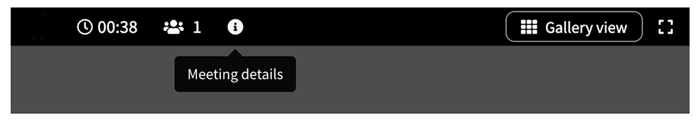
4. Updated Information Bar
To make it easier for current clients and more appealing for guests coming in from other services, the view change (Gallery View and Speaker Spotlight) and full-screen buttons have been brought up to the top right of the information bar. At the top left, the timer, participant count, and recording notification have remained in place. This information bar now remains static.
Furthermore, participants can click the New Info button where they can easily see the meeting details. This information can also be accessed from the bottom menu bar.
FreeConference.com is proud to offer these updated functions and bring clients the best user navigation and experience possible. As a result, we’ve been able to declutter the page and make it more visually appealing and intuitive to use. With more commonly used commands available upfront and less used commands accessible via the overflow menu, plus settings that are only a few clicks away, participants can expect a high-quality calling experience that mirrors today’s current video conferencing trends.
Ready to sign up and try it for free? Sign up here or upgrade to a paid plan here.
Host a Free Conference Call or Video Conference, Starting Now!
This website uses cookies so that we can provide you with the best user experience possible. Cookie information is stored in your browser and performs functions such as recognizing you when you return to our website and helping our team to understand which sections of the website you find most interesting and useful. See our Privacy Policy for more information.
FreeConference.com does not sell (as “sell” is traditionally defined) your personal information.
That is, we don’t provide your name, email address, or other personally identifiable information to third parties in exchange for money.
But under California law, sharing information for advertising purposes may be considered a “sale” of “personal information.” If you’ve visited our website within the past 12 months and you’ve seen ads, under California law personal information about you may have been “sold” to our advertising partners. California residents have the right to opt-out of the “sale” of personal information, and we’ve made it easy for anyone to stop the information transfers that might be considered such a “sale”. To do this you need to disable cookie tracking in this model.
Strictly Necessary Cookies
Strictly Necessary Cookie should be enabled at all times so that we can save your preferences for cookie settings.
If you disable this cookie, we will not be able to save your preferences. This means that every time you visit this website you will need to enable or disable cookies again.
Google Analytics
This website uses Google Analytics to collect anonymous information such as the number of visitors to the site and the most popular pages.
Keeping this cookie enabled helps us to improve our website.
Please enable Strictly Necessary Cookies first so that we can save your preferences!
Additional Cookies
This website uses the following additional cookies:
Act-On
Facebook
Zoom Info
FullStory
Please enable Strictly Necessary Cookies first so that we can save your preferences!
 Over the past few months, we’ve been taking into consideration how our clients use our video conferencing technology, especially on the new Meeting Room where most of the magic happens! Through research, planning and diligently reaching out to clients, we’ve been assessing what we can do in the back-end to improve the customer in-call experience in the front-end.
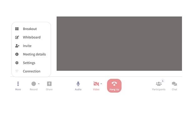 1. The New Toolbar Location
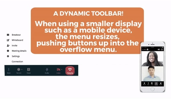 2. A Dynamic Toolbar
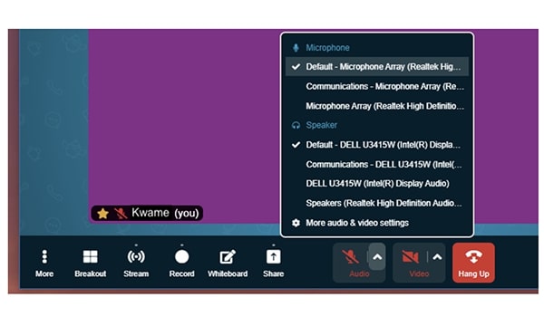 3. Better Access to Settings